PAL Chatbot Usability Redesign
Categories: Tech Writing, Accessibility, Design
Role: Usability Analyst & UI/UX Designer (Team Project) | Tool: Figma
Primary Competencies: Usability Testing, User Research, Interface Design, Prototyping, Technical Reporting
Project Goal
This collaborative project focused on enhancing the usability, accessibility, and overall user experience of PAL, an AI-powered personal learning assistant chatbot used in Dr. Blackburn’s TCID 2090 course at UCCS. Working with two fellow students (Janel Beedle and Ashlyn Lopez-Medina), our goal was to conduct a comprehensive usability assessment, identify critical areas for improvement based on user feedback and heuristic principles, and propose a concrete solution through a redesigned, high-fidelity interactive prototype built in Figma.
User Research & Analysis: Understanding the Starting Point
Our first step was to thoroughly understand the existing PAL experience from the students' perspective. We designed and executed a usability testing plan involving three senior-level students who represented the target user group. During these sessions, we observed their interactions with the current PAL interface as they attempted specific tasks related to finding course information.
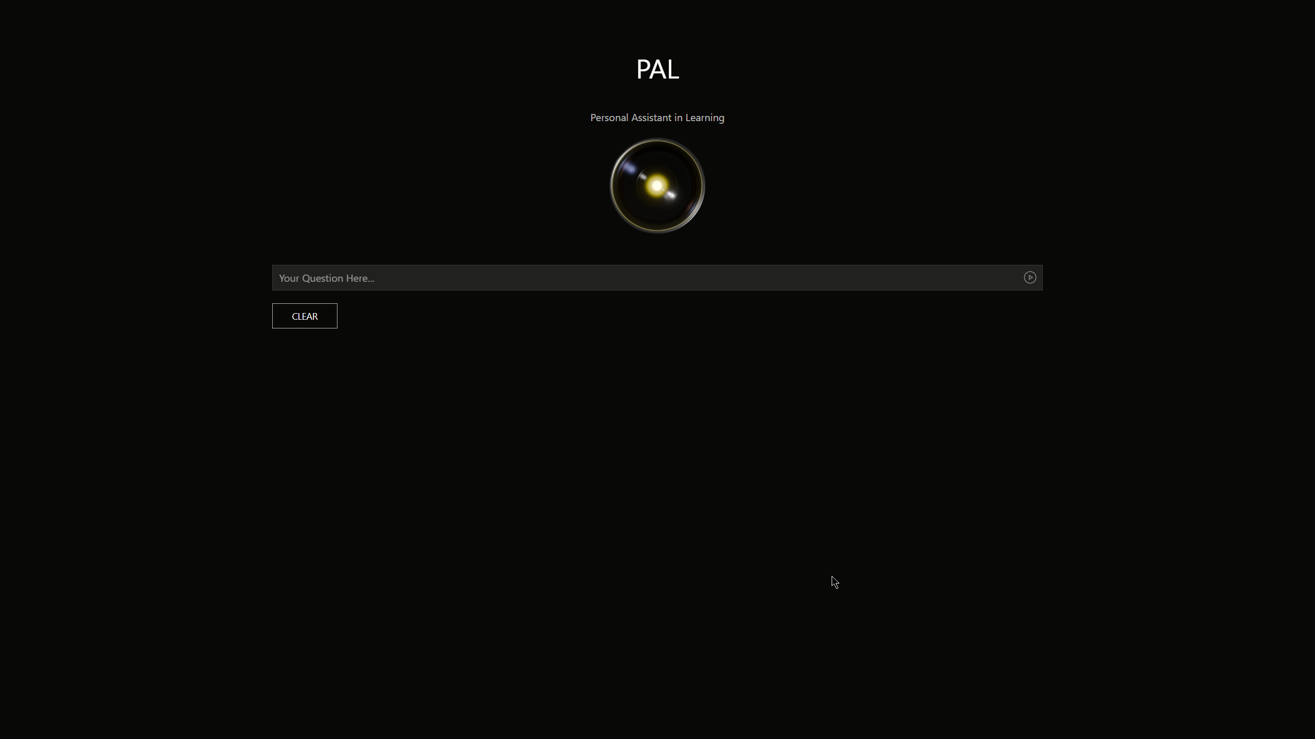
The original interface, while functional, presented immediate areas for potential improvement. Our testing confirmed this, revealing key findings:
- While users found PAL somewhat intuitive for basic queries, they hesitated to use it frequently (100% expressed hesitation).
- The interface felt unfamiliar (rated 'somewhat unfamiliar' or 'not familiar at all').
- There were varying levels of trust in PAL's answers and occasional difficulty discovering specific features or navigating effectively.
- All participants indicated they'd be more likely to use PAL with an updated interface.
To further contextualize these findings, we developed user personas and journey maps. This process, informed by our test results and research into educational chatbot best practices, helped us empathize with student needs, anticipate potential frustrations, and define clear goals for the redesign.
Recommendations & Design Process: Building a Better PAL
Synthesizing the data from our usability tests and analysis, my team formulated a set of actionable recommendations. We prioritized changes that would have the highest impact on user satisfaction and engagement:
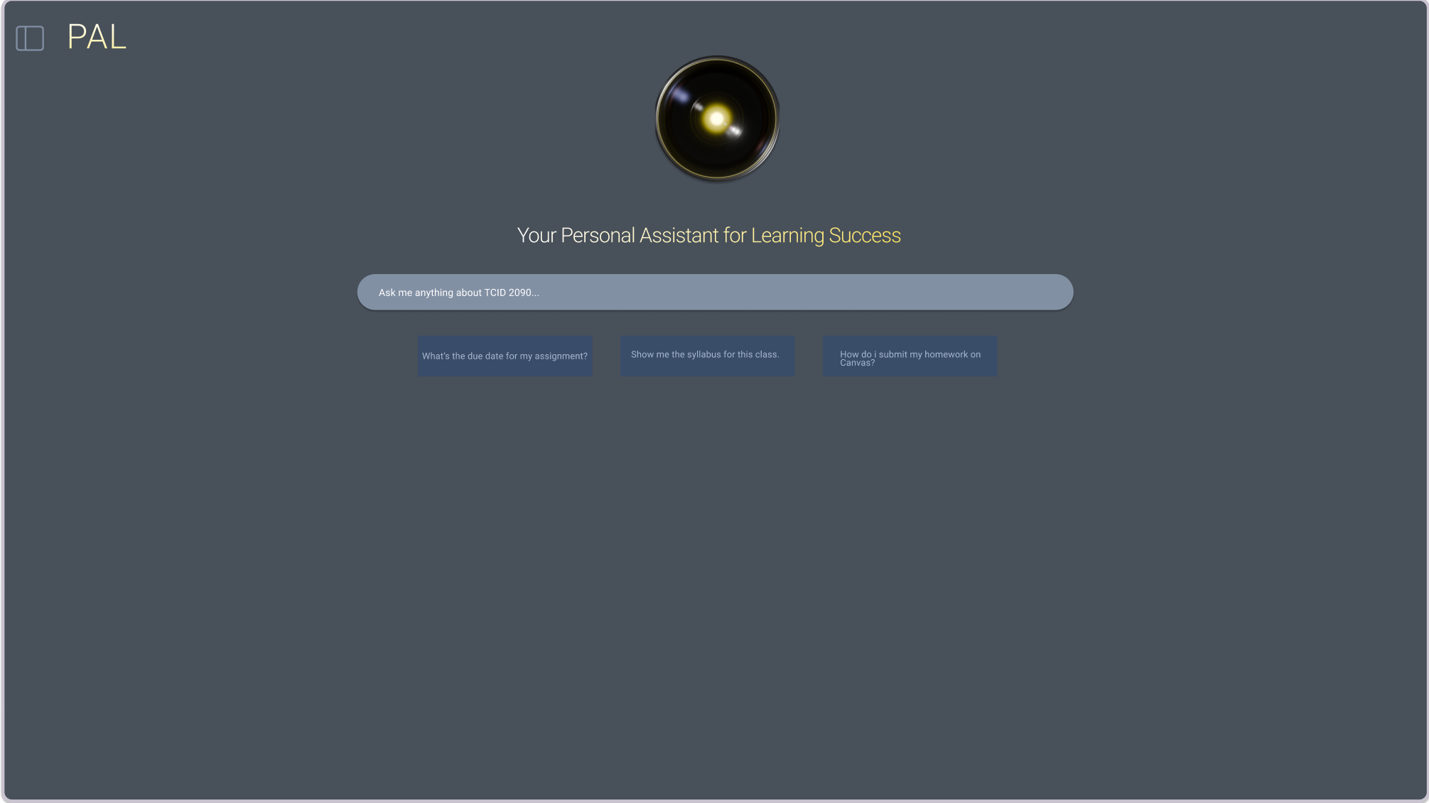
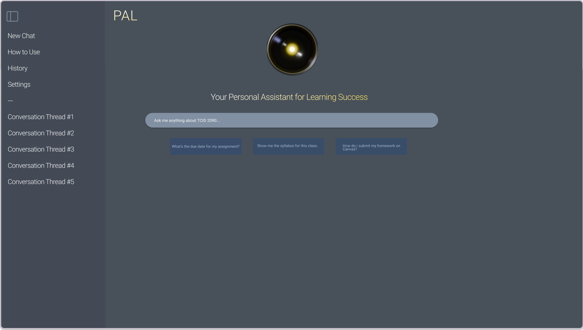
- Modernize the Interface: Implement a clean, visually appealing design (moving away from stark black) with improved hierarchy and consistent elements.
- Improve Navigation & Guidance: Add clear section headings, introduce a persistent navigation structure (like a sidebar), provide "How to Use" information, and add clear example prompts.
- Enhance Functionality: Incorporate features like conversation history saving/browsing and ensure clear visual separation of user queries and bot responses.
With these recommendations as our blueprint, we moved into the design phase using Figma. I initially sketched low-fidelity wireframes to explore different layouts for the core components, focusing on information architecture and addressing the navigation weaknesses we identified. We iterated on these early concepts, incorporating feedback from the team and our instructor.
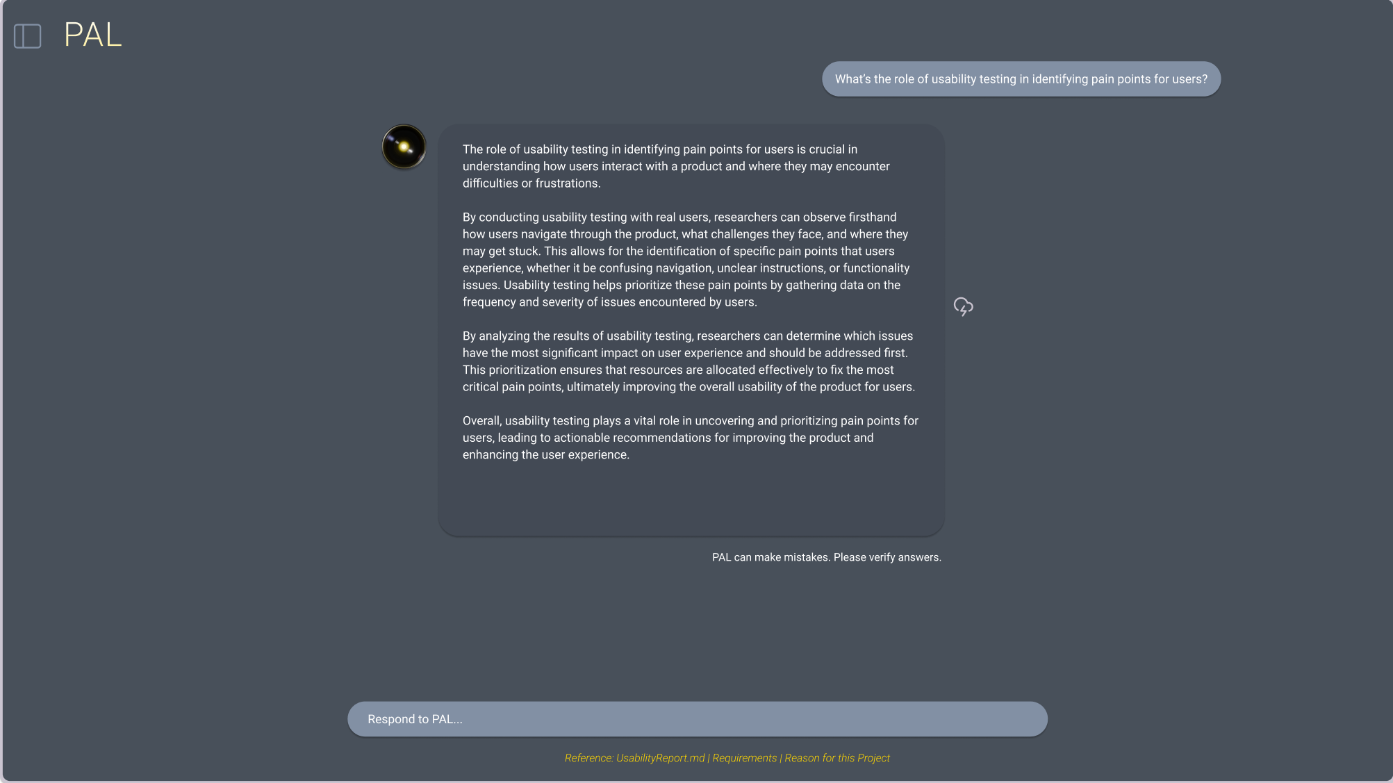
The next stage involved translating these refined ideas into a high-fidelity interactive prototype. I focused on building out the key screens, implementing the modern aesthetic with a softer color palette to reduce visual fatigue, clear typography, and improved visual hierarchy. Specific enhancements I prototyped included:
Throughout this process, I leveraged Figma's collaborative features to share progress with my team, gather continuous feedback, and make real-time adjustments, ensuring our final prototype accurately reflected our collective design decisions.
Outcome & Presentation: Showcasing the Solution
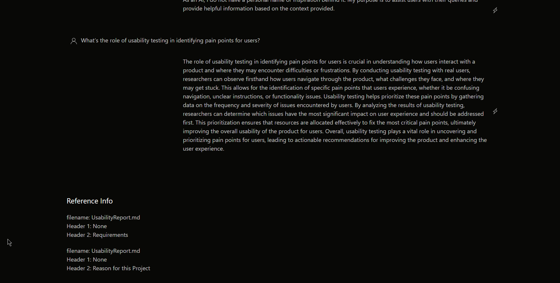
The culmination of our work was a comprehensive usability report detailing our methodology, findings, recommendations, and the rationale behind our design choices. I contributed significantly to writing and structuring this report. We presented our findings and the redesigned concept to our stakeholders (Dr. Blackburn and the class).
The high-fidelity Figma prototype was central to this presentation, allowing us to effectively demonstrate the proposed improvements and how the redesigned PAL offered a more intuitive, engaging, and user-friendly experience compared to the original. The feedback indicated that the proposed changes directly addressed the key usability issues identified during our initial research.